

 What inspired me to start some quick studies of a single flower was a book I got as a gift - "The Flower Painter's Pocket Palette," by Elisabeth Harden. It's a small book and describes itself as an "...instant visual reference on colors and shapes." I would recommend it for the beginner or as a quick reference for anyone. The book has several examples of how to paint different colors and shapes of flowers, showing examples of a 2 or 3 step painting process. If you are interested in the book, you can take a look at it here.
Anyway, I decided to test out my various yellows, as a comparison, and also to see how well they worked on the Aquabee paper (see sketchbook page above). The sketchbook features heavyweight drawing paper for both wet and dry media. It does have a slightly textured surface, and withstands light washes well. I did have some buckling with heavier washes. The white paper is bright, but not overly so. It isn't sized like watercolor paper, so there isn't a lot of nice flow and mingling of color, like a good cold-press watercolor surface. The color stays brilliant, though.
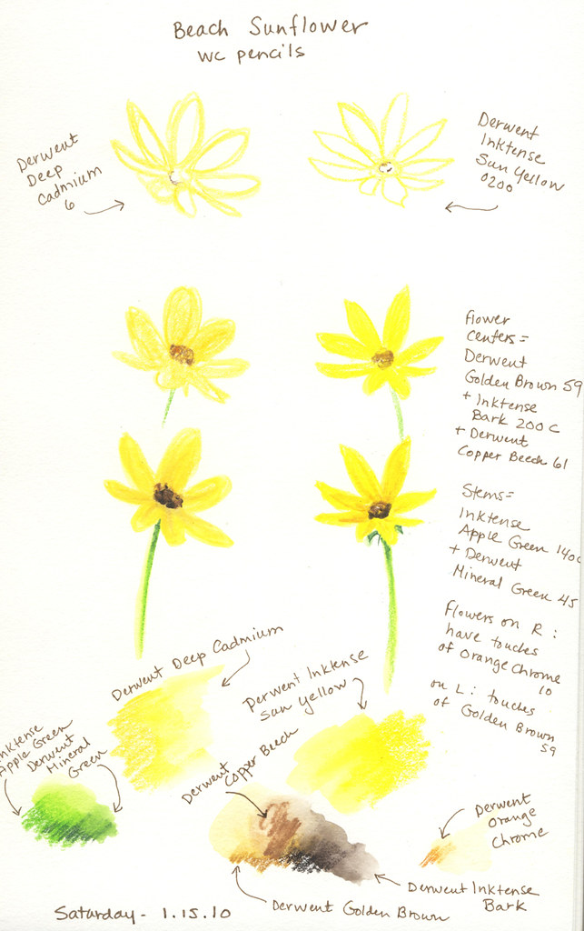
Next, I thought I'd try out my water-soluble pencils: a combination of Derwent regular and Inktense (the next sketchbook page). I did a 3-step example so I could remember the process in the future. Once again, the colors didn't flow as well together as I would have liked, but the tooth made for some nice pigment textures!
I learned a lot form these simple exercises.
- I need to practice more with watercolor washes to get the hang of the different paper.
- My yellows are quite different looking when I compare them side-by side.
- This paper seems to do well when I work in layers, letting each one dry well between painting or drawing.
- I also learned a bit about how other artists use color mixes in their flower painting.
- And I learned about a new color: brown-pink, which actually looks like a yellowed medium to light brown. That started me off on a whole new tangent investigating organic pigments...but that's for another day!
I'm tickled to have stumbled on this post. I have the little book that you referred to. How you used the book for a painting adventure is very interesting to me. I'll have to give it a try. I love your sunflowers or daisies.
ReplyDeleteHi Claire, thank you stopping by. Thanks for your comments, too! That book was a great find, and something I'll use again and again. How cool that you enjoyed it too. :)
ReplyDelete